Less is More
- Carissa Del Castillo
- Jun 8, 2021
- 2 min read

Updated: Jun 14, 2021
Written for: Alchemy Advertising (2016)

Less is more.
Originally from the poem The Faultless Painter by Robert Browning, published in 1855, about the painter Andrea del Sarto, the adage was later adopted in 1947 by architect Ludwig Mies van der Rohe as a precept for architecture and minimalist design. As the years pass, however, and trends came and went, minimalism is gradually making a much needed comeback, not only through designs in modern architecture, but especially in advertising.
Many people have adopted the phrase as a personal mantra, and many advertising companies are not far behind on catching on and doing the same thing. Because of the lack of visual clutter, the viewer’s eyes would directly go to the desired focal point, thus minimalism gives way for viewers to immediately focus on the message instead of anything else. Cramming too many visual elements into a limited, single space makes for visual noise that viewers will usually end up disregarding. Minimalism shows the bigger picture in the smallest and simplest way possible. A difficult feat, but many advertising campaigns have ultimately succeeded.

Photo 1: McDonald's: Wi-Fries - "love free wi-fi” // by DDB, Sydney, Australia

Photo 2: Microsoft unveiled its new look after rebranding in 2012
Companies not only started rebranding themselves to fit the latest innovation-turned-trend, but they have also begun taking the same minimalistic approach in marketing a whole range of their products and services. While minimalism is, in truth, nothing new, finding its origin from the artistic movements of 1960s Europe, it is only recently that such simple designs have risen in popularity due to being proven as an effective marketing strategy. It is a direct yet creative approach, set to eliminate the non-essential, and expose a certain essence or identity.
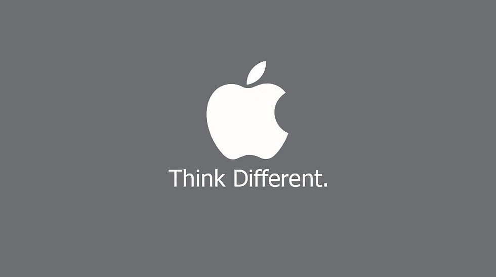
Photo 3: Apple logo & tagline
While the utilization of minimalism in advertising is expected to become even more prominent in the next few years, essentially, however, one cannot talk about minimalism in marketing without mentioning Apple. From its logo to product designs to even the retail stores, Steve Jobs has done a brilliant job in showing the audience that Apple is a company that is both cool and cutting-edge. Apple proved to be one of the more memorable, if not the best, users of the minimalist approach in the industry. Apple proved concept to be effective in making a strong impression and evoking brand recall.
Minimalist advertising, despite its straightforward nature, leaves room for the imagination. Instead of simply spoon-feeding information to the audience, the ad leaves them curious and intrigued – an open, no-strings-attached invitation to check them out. Because while advertisements that are visually and verbally thorough might be informational and compelling, it ends up looking like a desperate attempt at hard selling a product. In other words, chatty advertisements leave the audience bored and disinterested. Minimalism requires only the needed material to show why the product or service is the better option, and shows a company’s confidence in what their product has to offer.
A simple, well-thought out photo and short tagline definitely works more wonders, proving that quality is, indeed, better than quantity.
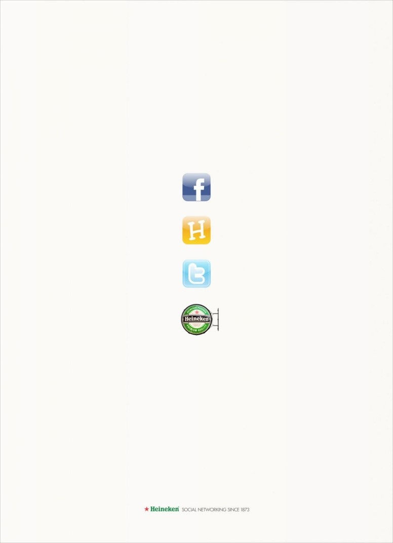
Photo 4: Heineken - "Social Networking Since 1873"
Reference:
http://www.peppertt.com/blog/traditional-advertising/less-more-20-minimalist-print-ads-that-inspire/


Comments